Form Designer #
Welcome to our Form Designer, your all-in-one tool for crafting registration forms with ease. Say goodbye to toggling between editor tabs – now you can design your form and questions seamlessly within one intuitive interface.
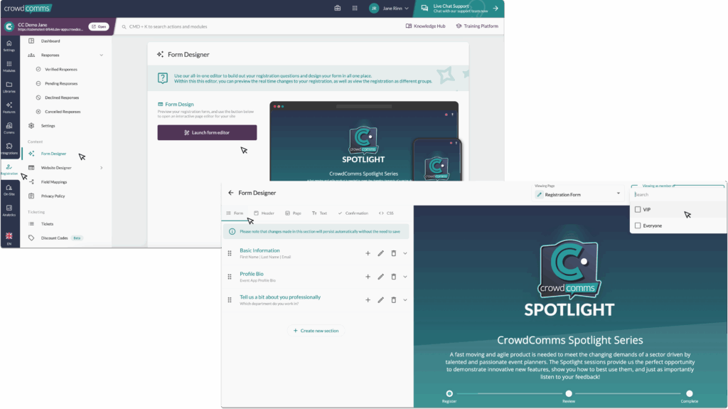
Ready to get started? Simply head over to the Registration tab and dive into the management menu. Click on ‘Form Designer – Beta’ to unleash the power of our interactive editor.
Once inside the Form Designer select the ‘Launch form editor’ button and you’ll find a sleek preview of your registration form. Need to tweak the layout or preview it for different groups? No problem. Utilise the dropdown menus at the top right to tailor your view precisely to your needs. From this drop down you can select each page for various stages of the registration journey and edit them accordingly.
And here’s the best part – every change you make is instantly reflected in the real-time preview panel on the right. No guesswork, just seamless design.
So, what are you waiting for? Let your creativity flow and watch your registration form come to life effortlessly.
#
#
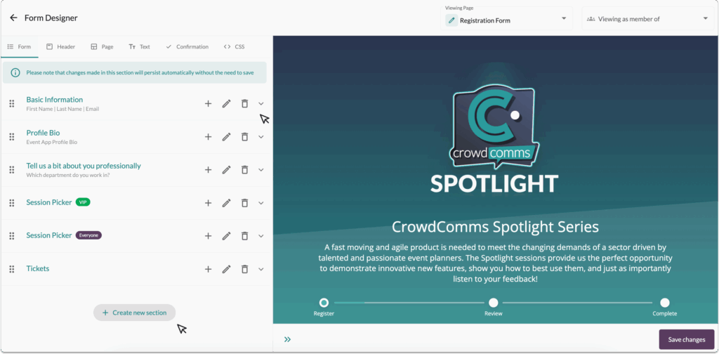
Form Tab Overview: #
In the Form tab, you wield the power to shape your registration form exactly as you envision it. We’ve streamlined the process by auto-generating a basic information section, complete with fields for Email, First Name, and Last Name, so you can hit the ground running.
Adding new fields to this section is a breeze – just click the ‘+’ icon. And if you need to bid farewell to a section, simply click on the ‘Bin’ icon. Need to tweak the details of a section? The ‘Pencil’ icon is your go-to for quick edits.
But wait, there’s more! Feel free to expand your form’s horizons by creating new sections with a simple click of the ‘Create new section’ button.
Ready to unleash the full potential of your registration form? Let’s dive in!
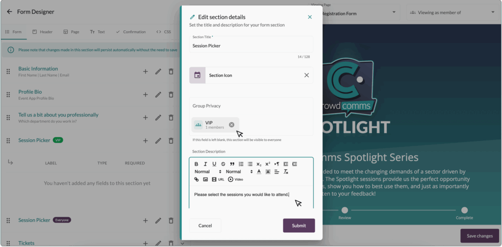
When fine-tuning your section, you’re in control. Edit the Section Title and Icon to ensure clarity and cohesion within your form. Want to tailor visibility? Add a ‘Group’ to restrict access to specific people groups, ensuring information is shared selectively. And for added context, enrich your section with a description.
If you click on the ‘v’ icon, the section will expand and display the list of fields you have added for that section. To edit the field, click on the ‘Pencil’ icon. You can also move the field into another section by clicking on the ‘Double Arrows’.
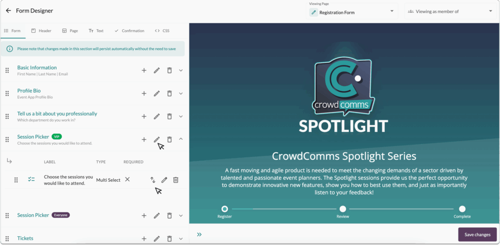
Finally, to re-order the field or the section, click, hold, and drag the field or section. Field Options within the Form Field Configuration
For more information on creating your form, please click here.
Header Tab Overview #
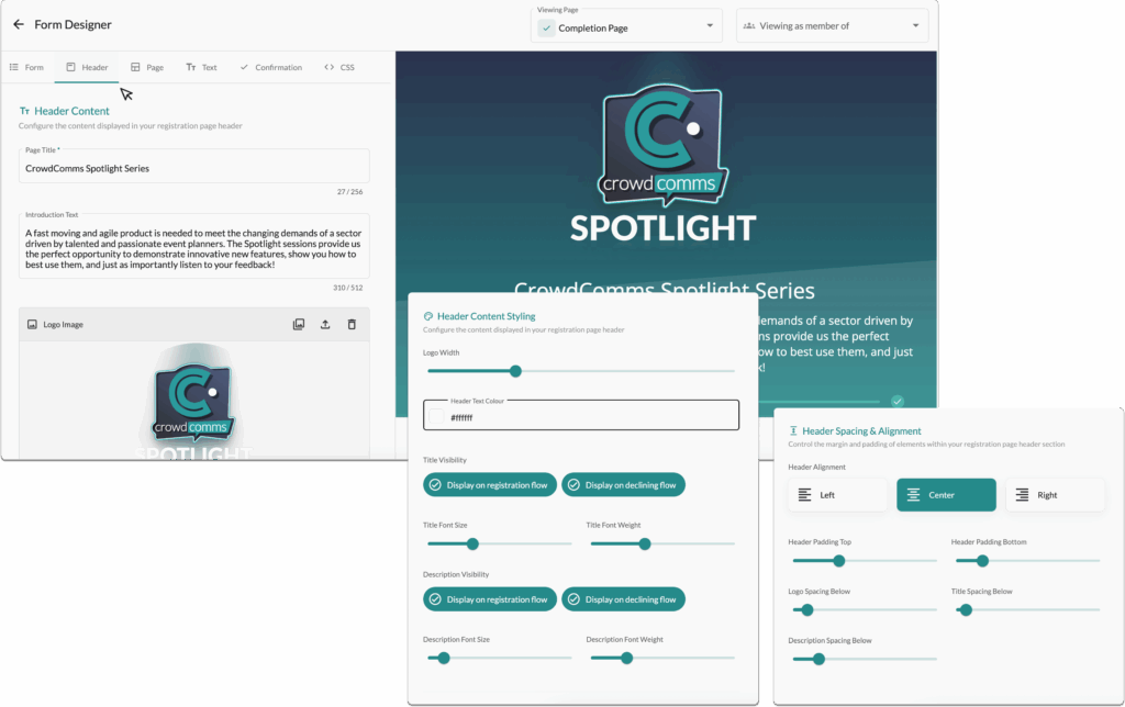
The Header tab contains the settings for customising the header of your registration page.
You can set the page title, add introductory text, upload a logo, and fully customise the size, colour, and positioning of your header elements.
Page Tab Overview #
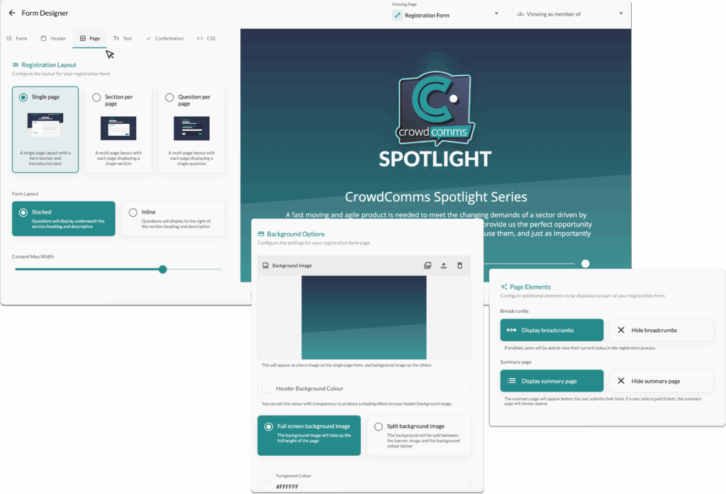
The Page tab contains the controls for the main body of your registration page.
Here, you can choose the overall layout whether to display all questions on a single page, divide them into sections, or present one question per page.
You can also decide if questions should be stacked vertically or arranged inline.
Adjust the content width, set background colours or images, and add page elements to enhance the user experience.
Text Tab Overview #
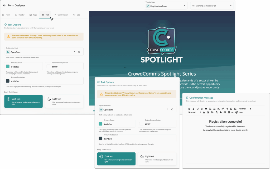
Fully customise the text and fonts used throughout your registration page.
Select a font from a library of Google Fonts, set your text colours and body text colour to match your brand.
You can also edit the messages users receive upon completing their registration, including the email verification and ‘not attending’ messages.
Confirmation Tab Overview #
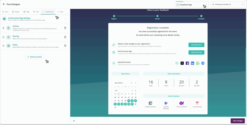
Admins can now easily configure a dynamic confirmation page using the new Confirmation tab in the form designer. The layout can be built and previewed in real time using the page selector in the top right.
Admins can add a wide range of sections to tailor the page to their event’s needs:
-
- Iframe: Embed external content such as hotel booking tools or Google Maps, with the option to add rich text alongside.
-
- Rich Text: Use the Quill editor to share additional information, images, or even embed videos.
-
- Event Dates: Display key event info, countdowns, and links for calendar integration with event date overrides (ideal for extended app access).
-
- Actions: Add buttons for registrants to edit their registration, access the event app, or share the event on social media.
-
- App Store: Provide direct links to native or progressive web apps.
-
- Footer: Include branding elements like the event name, dates, and a logo.
-
- Responses: Show a summary of all submitted responses, including guests.
-
- Tickets: Display consumed ticket information (excluding discounts).
-
- Ingo Social Widget (Coming Soon!): If the InGo Integration is enabled with a Social Widget configured, the social widget section type will display, allowing users to share their event via a widget to a social media platform.
-
- Custom HTML: Add fully custom content for advanced use cases.
CSS Tab Overview: #
The advanced tab offers you additional customisation through being able to edit and add your own CSS styling.
Once each tab is set and the preview looks just right, you’re good to go. Simply click the ‘Save Changes’ button to apply your edits. With a single click, your confirmation page is live and ready for attendees.


